
Get In The Robot
Brand identity for anime YouTube channel

objective
For 18-34 year olds interested in anime, YouTube only provided a space dominated by aggressive anime elitists. Frederator Networks hoped to create a channel that welcomed anime curious individuals, served as an educational tool for beginners and experienced fans, and ultimately created a safe space for a marginalized fandom and diverse audience.
solution
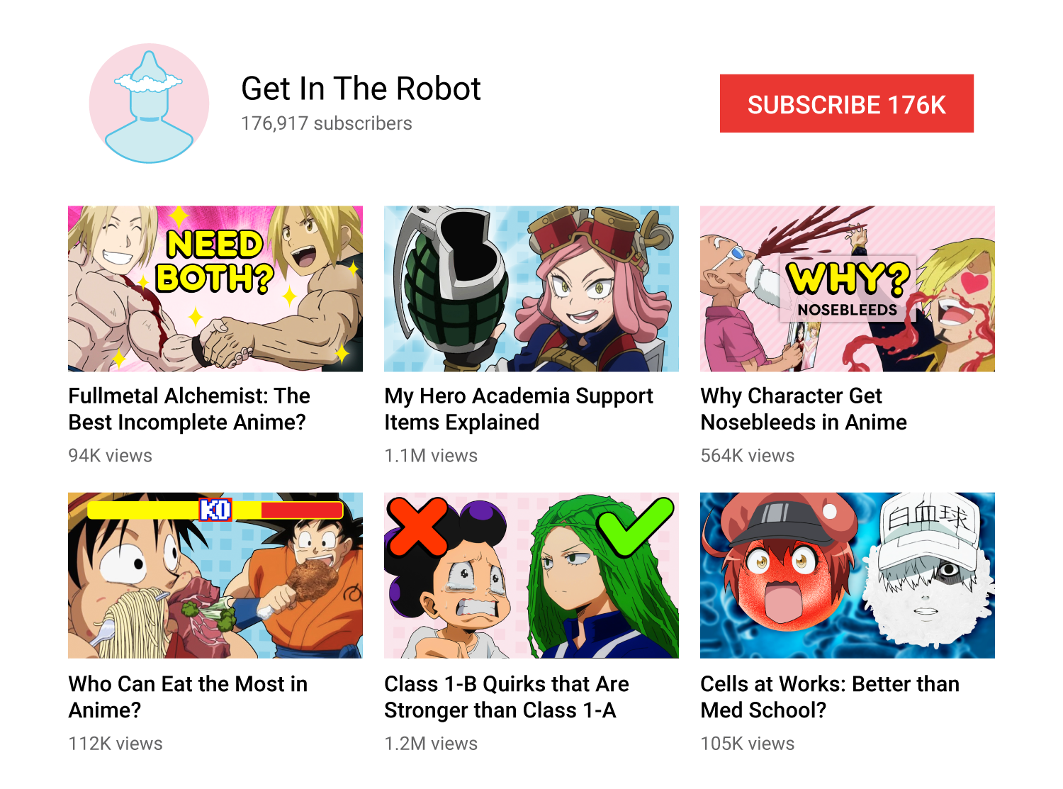
I worked with the channel manager and small production and marketing team from day one, naming the brand, designing a logo, identity, channel, in-video graphics, set, social media, website, merchandise, and extensive style guide. In less than 3 months of channel’s launch, the brand was recognized by fans at Anime NYC. Within 6 months, the channel hit 7.3 million views, gained 100K subscribers, and was awarded a silver play button. Numbers are currently around 10.6 million views and 176K subscribers, steadily rising on a weekly basis. Those views come from a global audience hailing from 50 different countries, our viewership being highest in the U.S., U.K., Canada, Australia, and the Philippines. We even have a few fans in Japan.
CONCEPT

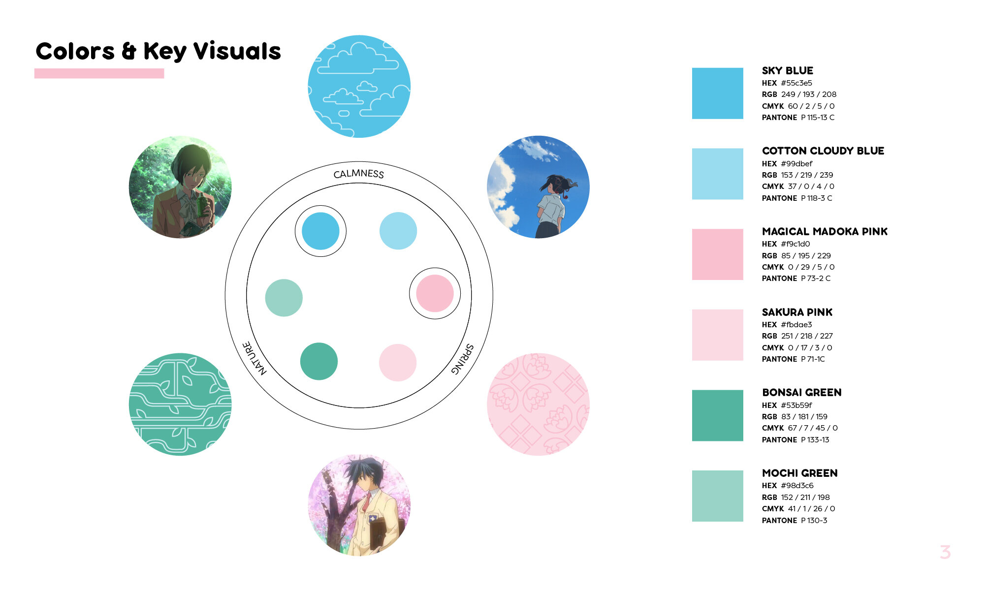
“Since Japanese culture is the root of anime, research was essential during this process to eliminate the possibility of appropriation. Get In The Robot’s color palette reflects the importance of nature in Japan.”


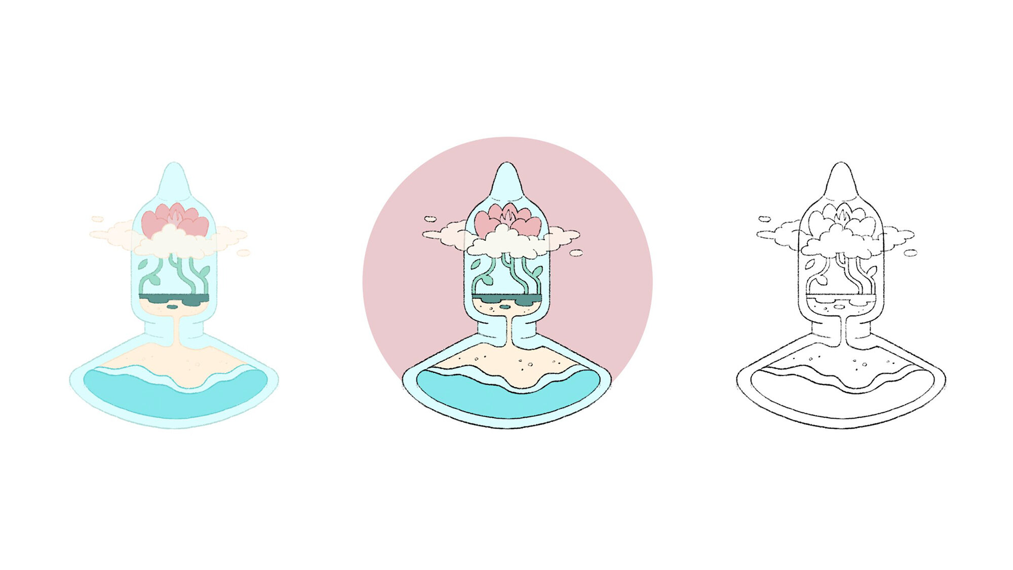
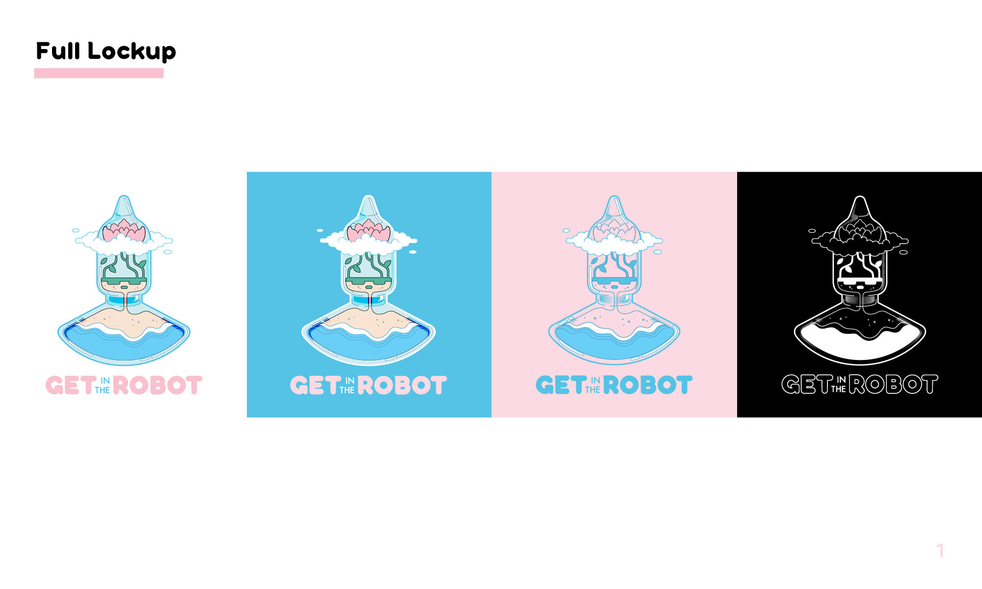
I chose to keep the Fred-Bot transparent so that you could see what was inside the robot. The robot, serving as a glass bottle terrarium, contains the unexpected. Instead of gears, we see nature and life thus giving a humanistic, emotional quality to something traditionally mechanical and emotionless. The Fred-Bot’s transformation into this safe space illustrated our audience’s destination for anime-fueled escapism.
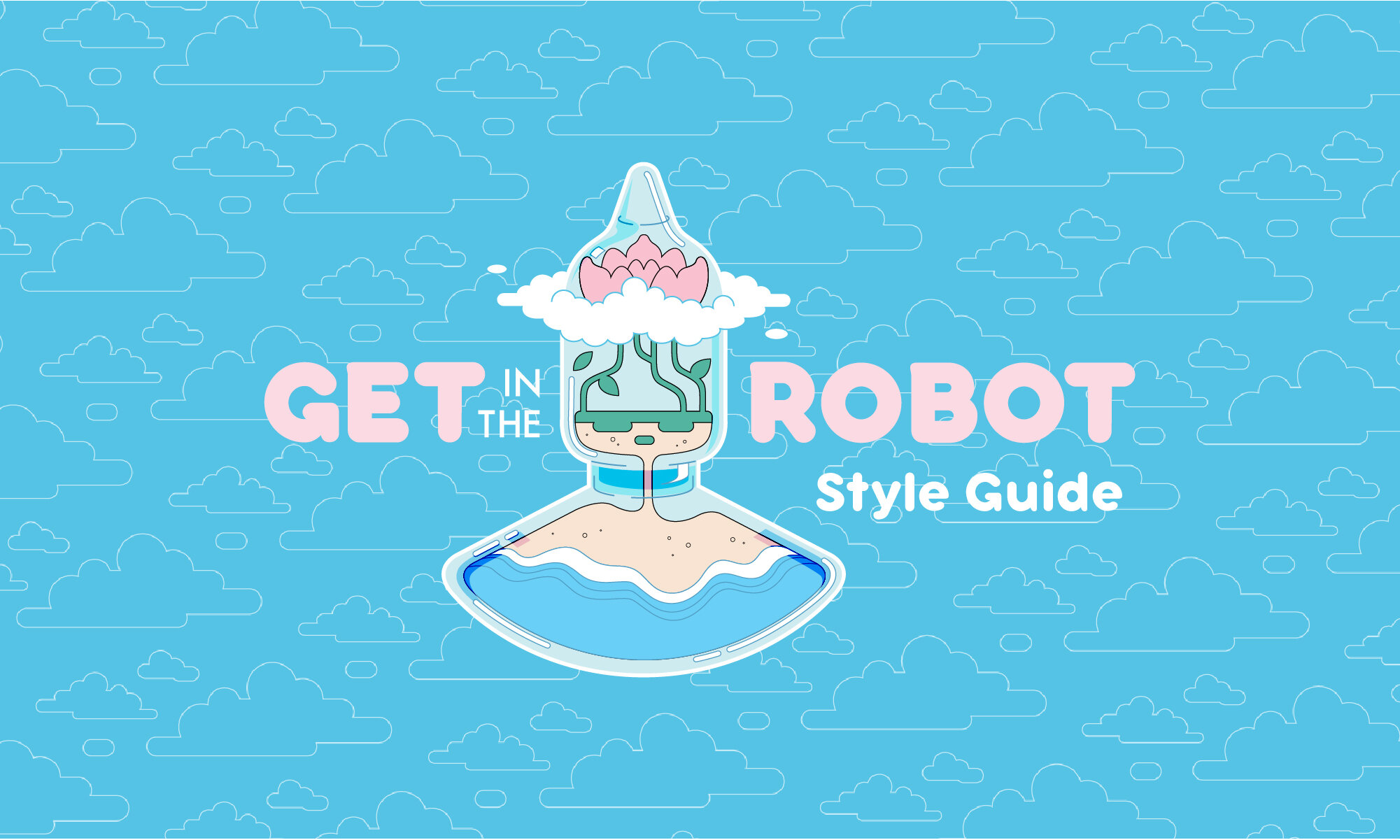
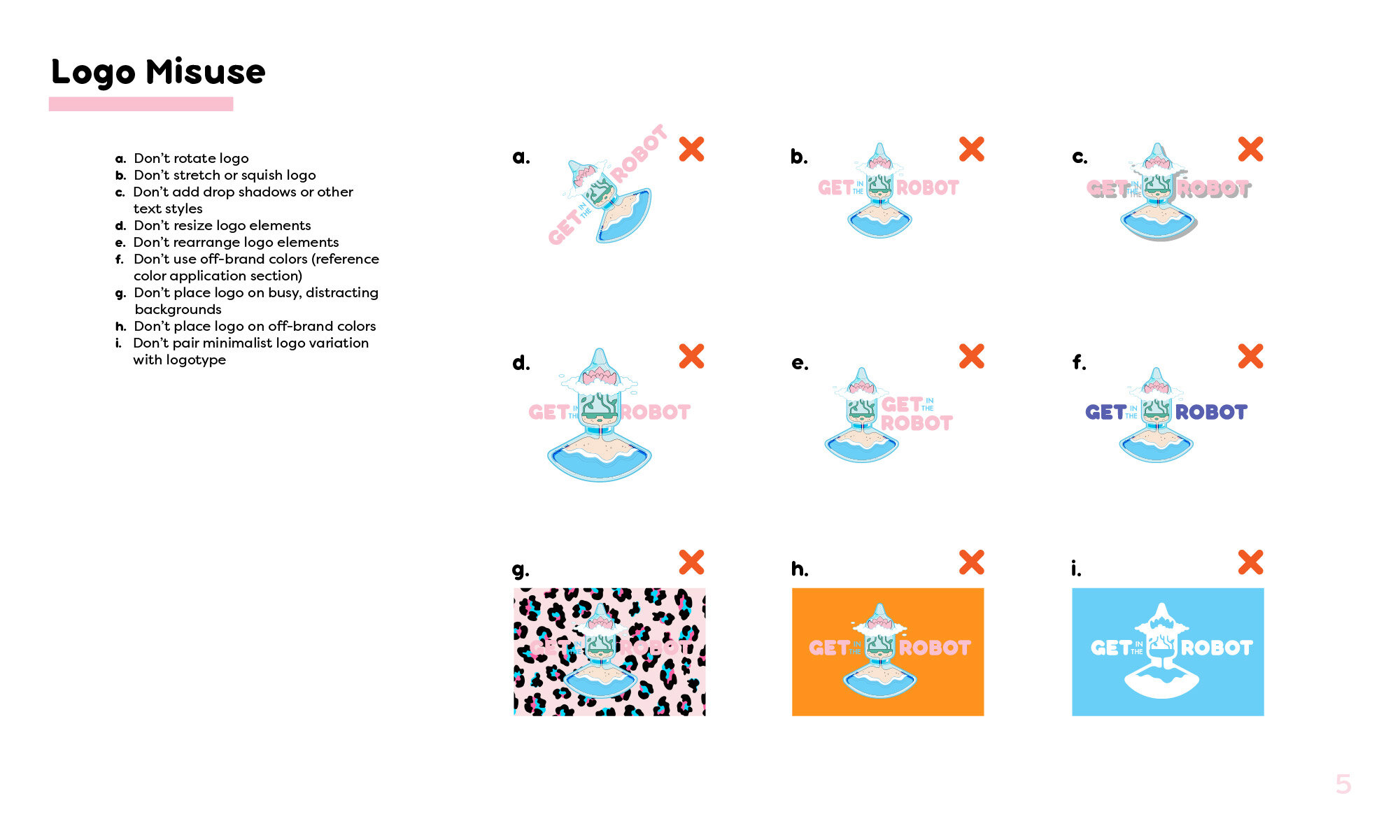
STYLE GUIDE
APPLICATION
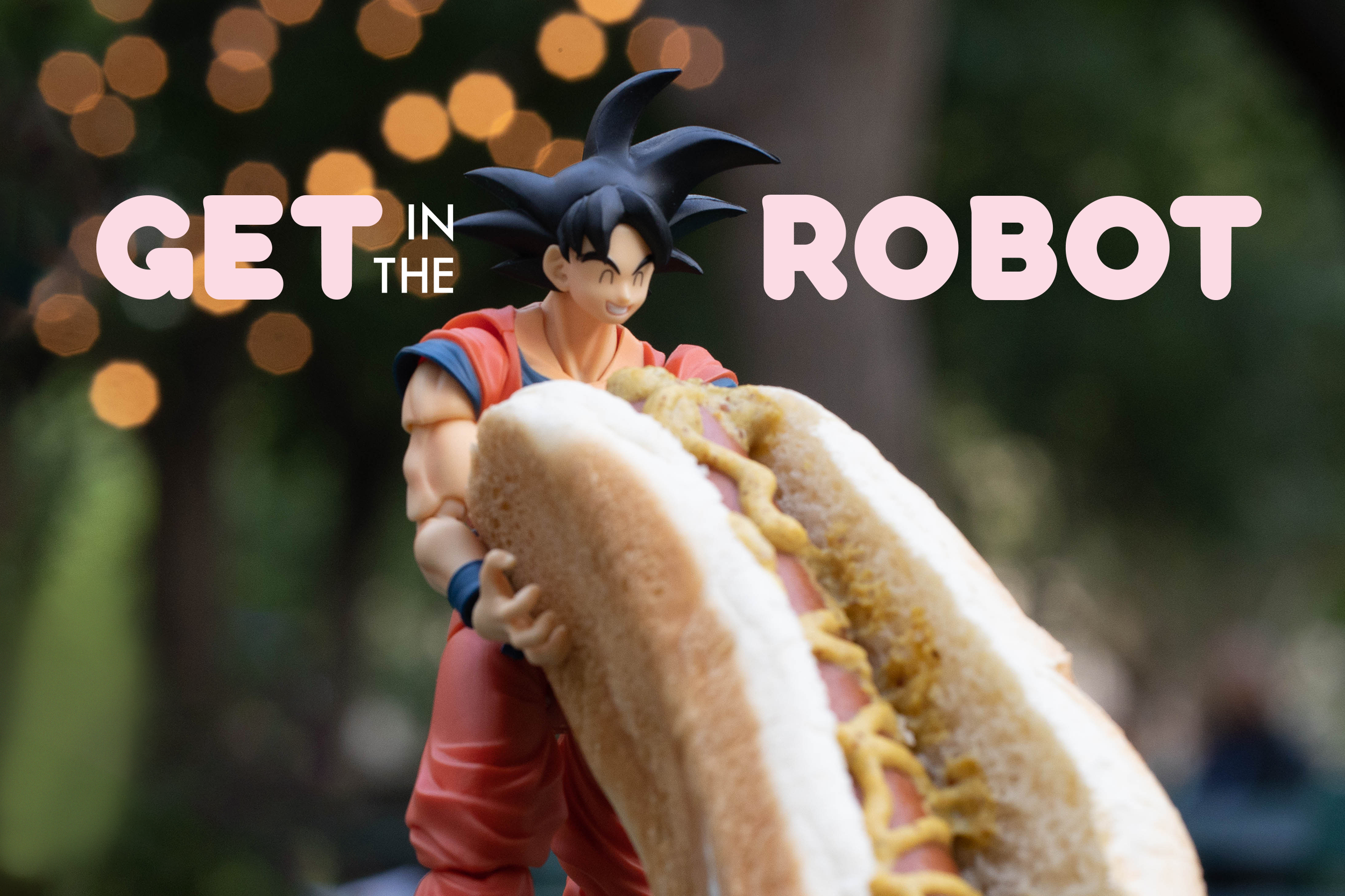
PHOTOGRAPHY


TYPOGRAPHY & ICONOGRAPHY


Brand promise poster series.
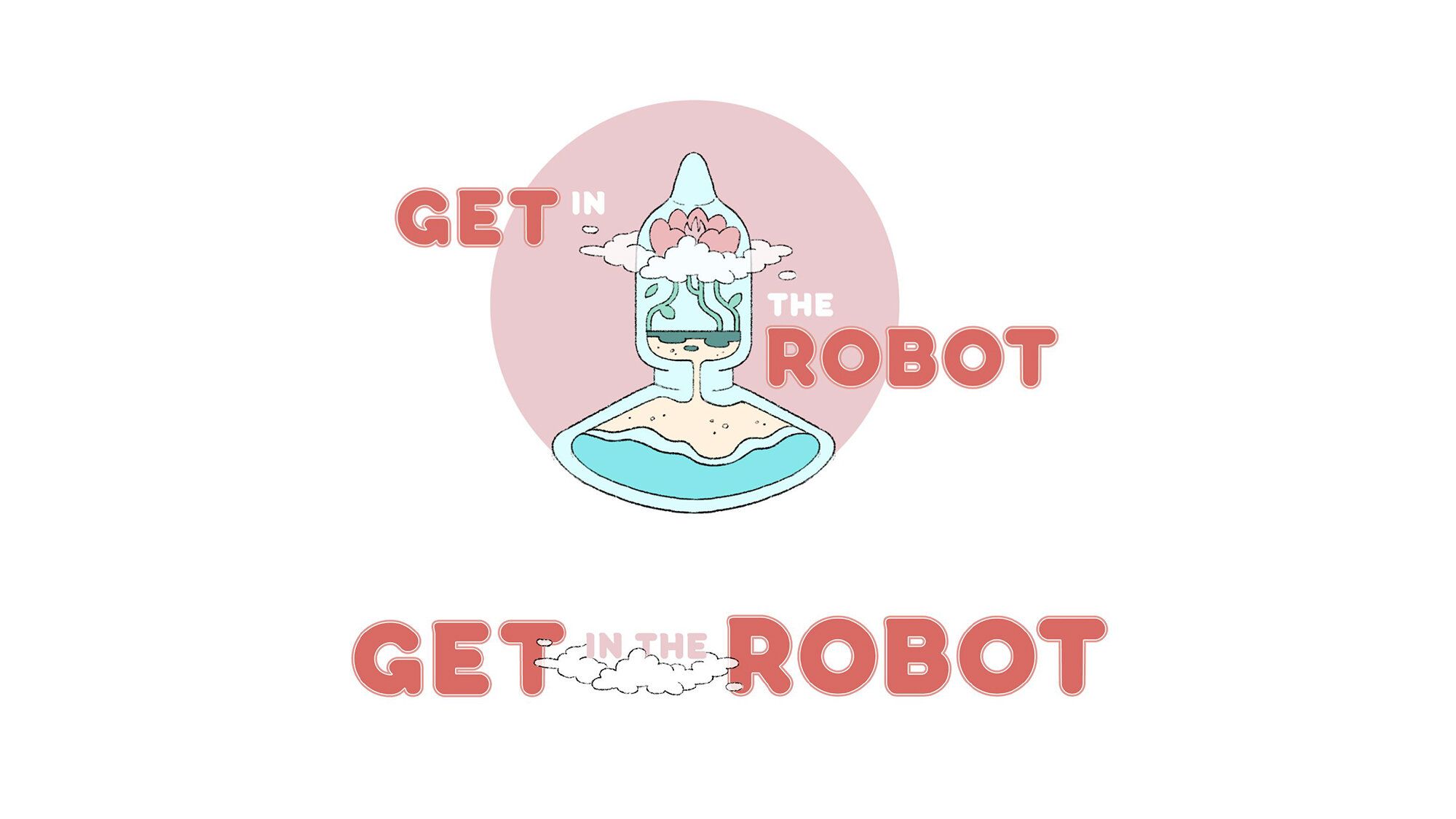
“Inspired by Madoka Magica’s logotype, I chose round, bubbly typefaces that exuded the soft, comfy vibes promised by the brand.”
CHANNEL & VIDEO GRAPHICS
“Not only does the brand’s trendy aesthetic resonate with our target audience, but Get In The Robot’s chill atmosphere, educational purpose, and minority representation.”
MERCHANDISE

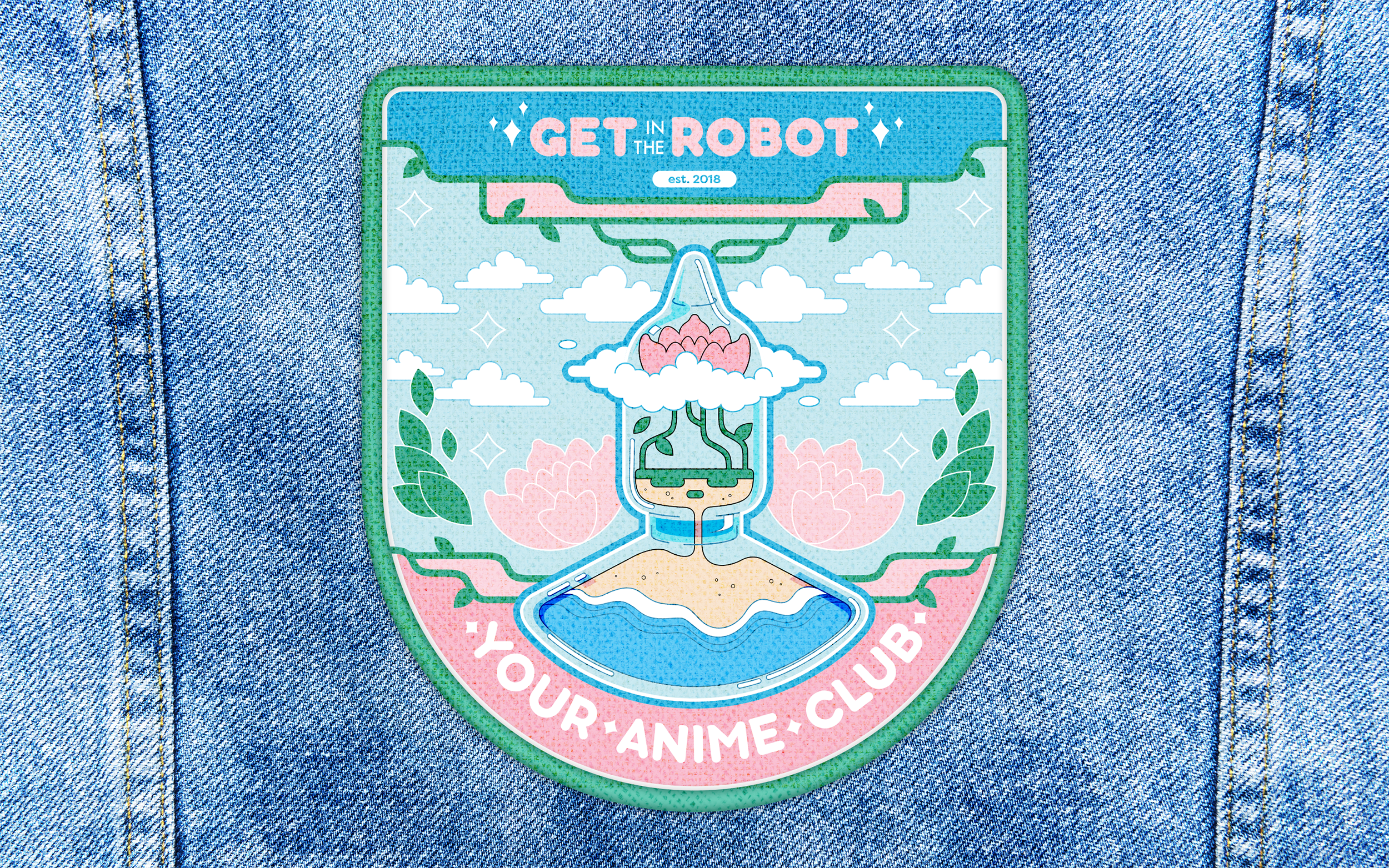
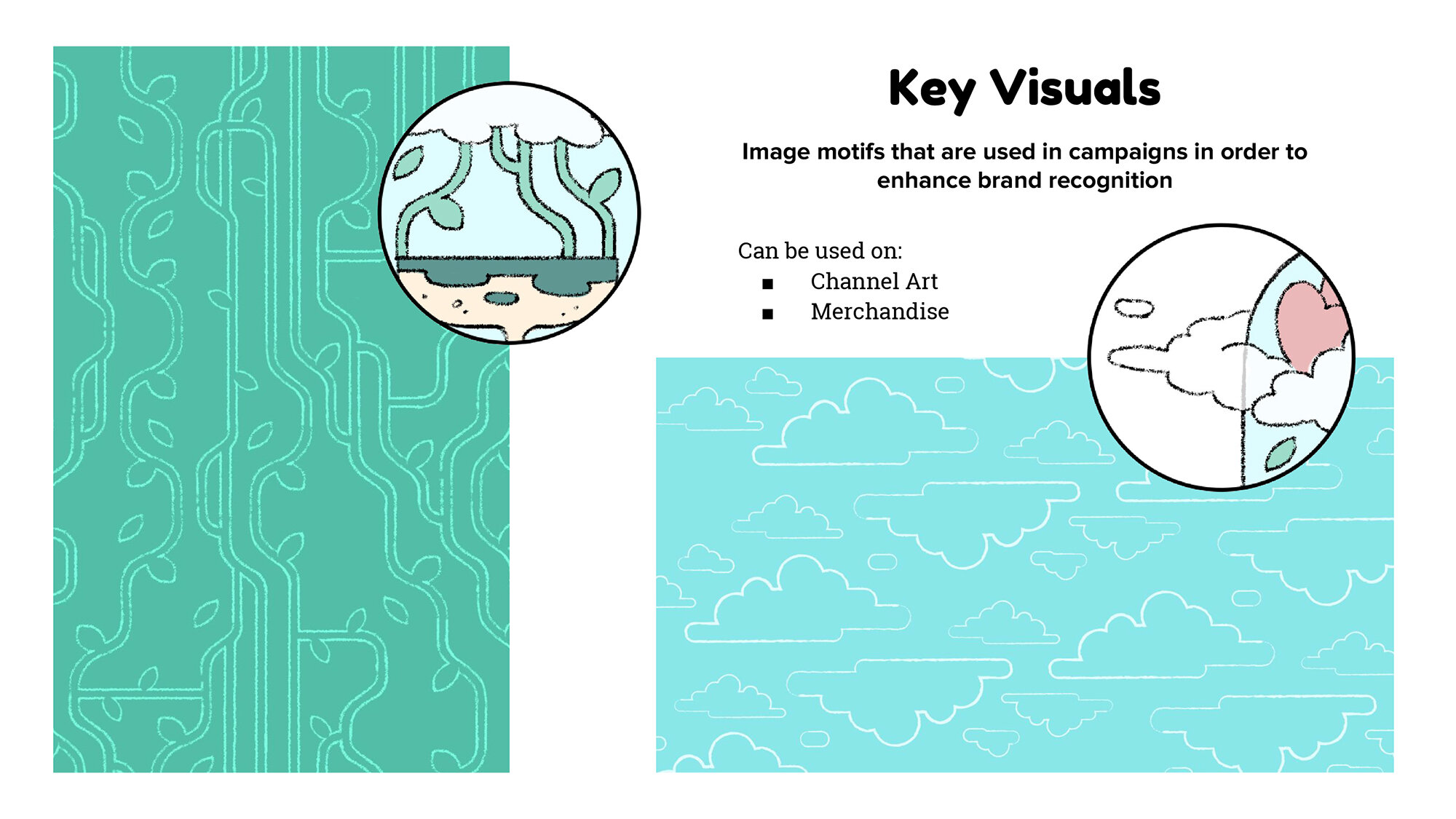
“Merchandise plays with the brand’s distinctive patterns and creates a new pattern by duplicating the logotype.”
© 2018 - 2020 Frederator Networks, Some Rights Reserved